
We created a user interview plan based on the learnings from previous research and interviewed 13 participants that represented our target audience. The key insights were:
· The amount of time and effort required to find relevant matches are high. The lack of meaningful connections despite that can lead to decline in the user’s mental health
· Disproportionate Male : Female user ratio makes men feel undesirable and lose confidence in finding matches
· Swiping and going by photos feel shallow for finding love. Conversation prompts help build connections and highlight the person’s personality and interests
· Bots and spammers make for an unsafe environment. Social media verification and mutual connections can ensure safety and confirm they are a real person
· Disconnect in strategies on dating apps : men typically try to set up in person dates sooner, whereas, women typically want to communicate virtually longer before meeting in person for safety concerns and checking for compatibility
· Need for easing the first-date scare to encourage more in-person meetups
· Show type of relationship the person is interested in and their expectations from dates, activities and hobbies
2 Define
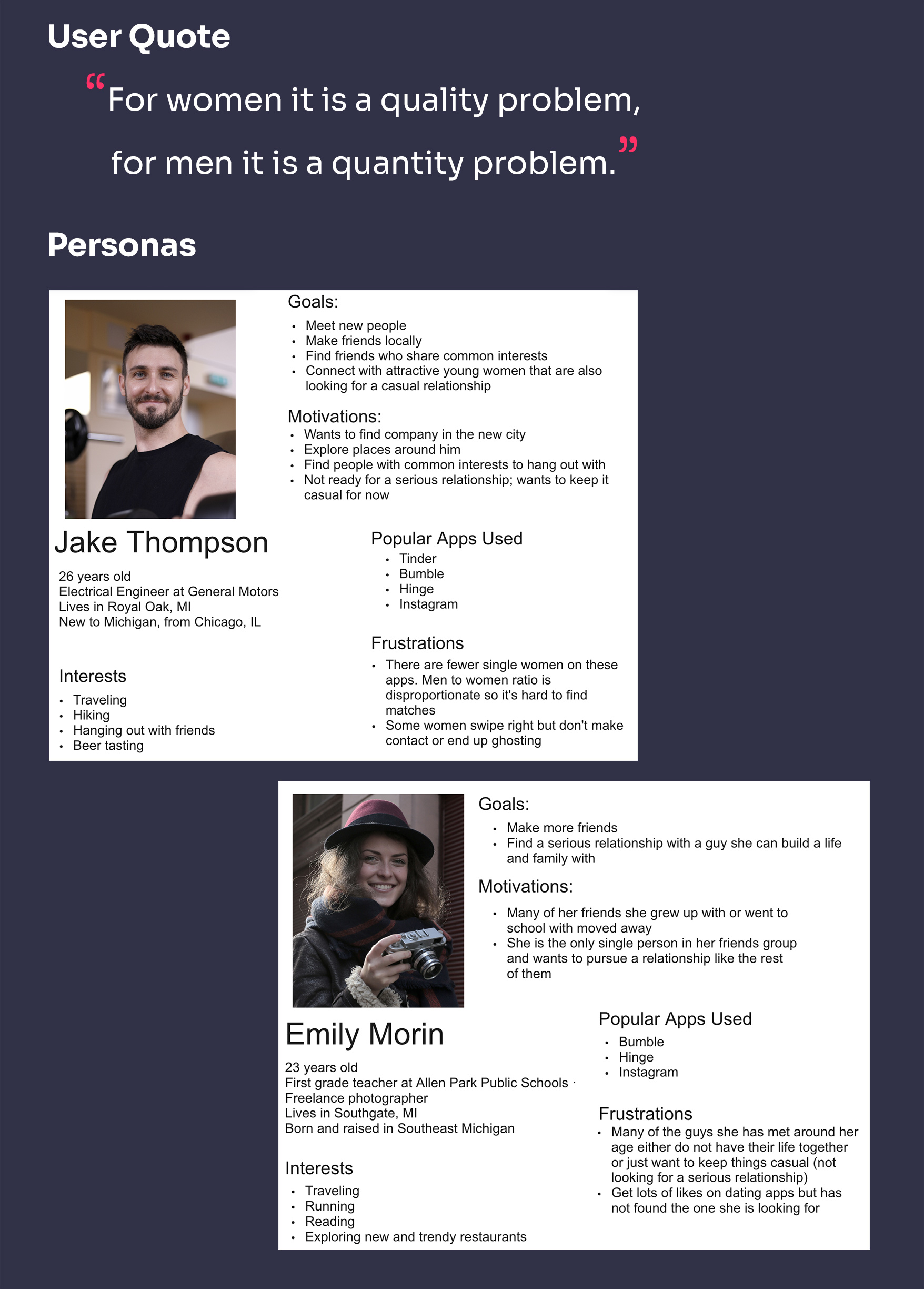
We used findings from Research to build User Personas - Jake and Emily. To find patterns and generate insights, we created an Affinity Diagram with notes from interviews.
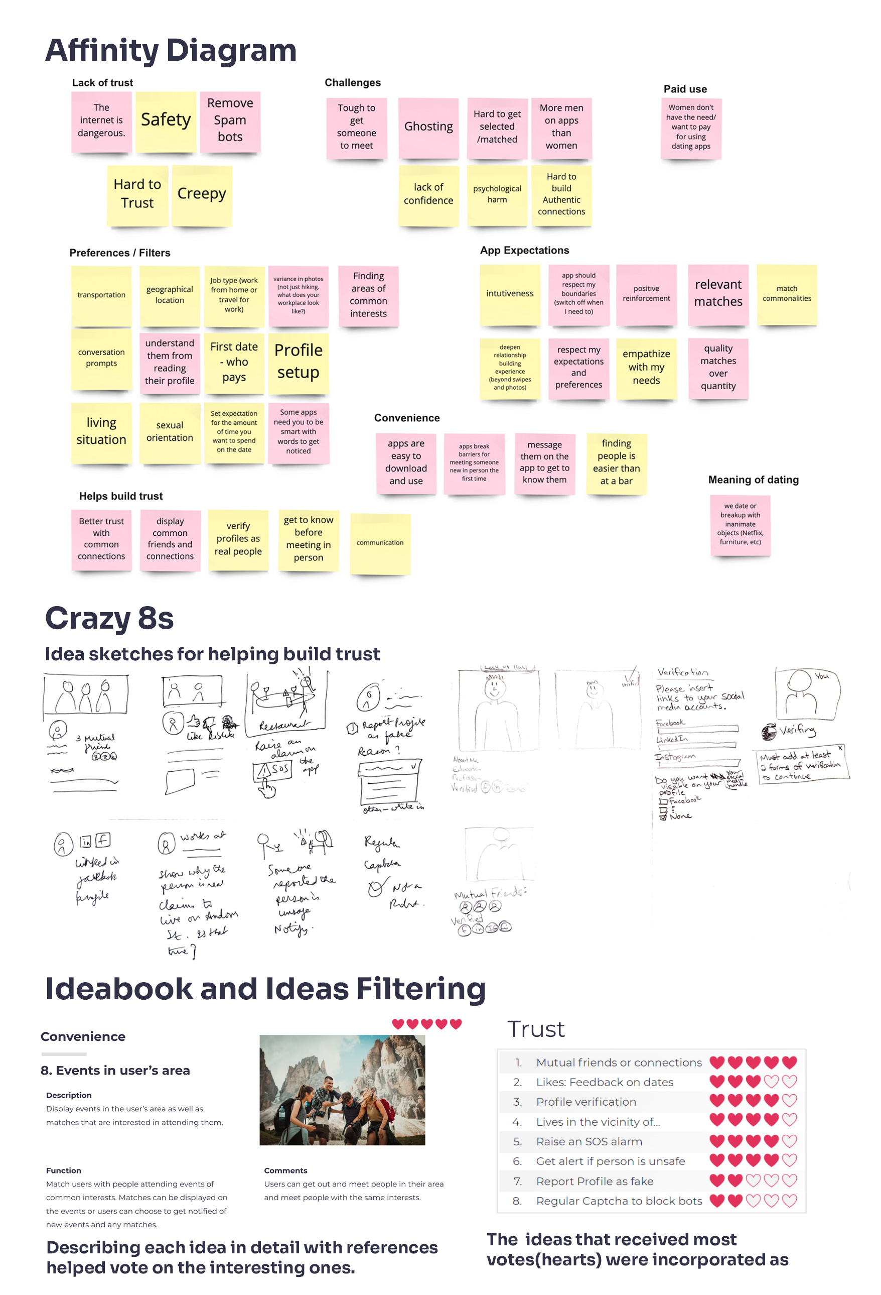
Affinity Diagram led to the discovery of the critical user needs and themes. The themes discovered were:
· Help build trust among matches
· Ensure safety during app use and dates
· Make it convenient to use the app
· Customize preferences and show matches accordingly
· Overcome challenges to set up real dates
The themes helped us refine our problem statement in the form of How Might We.
" How might we help people looking for relationships use a digital, online platform to find and build meaningful ones?”
"How might we enable building trust among matches and ensure safety during dates?"
3 Develop
We used the themes and problem statements during ideation to generate multiple ideas.
We did the "Crazy Eights" design thinking exercise where we spent 8 minutes sketching 8 ideas each, per theme. We built off of each other's ideas through brainstorming. We created an Ideabook with 32 ideas and added descriptions and references to every idea. We voted on the ones that were most interesting and used them in defining the key features on the Choosy app.
We created Animated Storyboards and narratives showing how we envision the ideas to address critical user needs. We created 2 storyboards :
· "How Jake met Emily" shows how our personas match with each other and progress from meeting virtually to building trust and meeting for a real date.
· "Date Gone Wrong" highlights how Choosy ensures safety during dates.
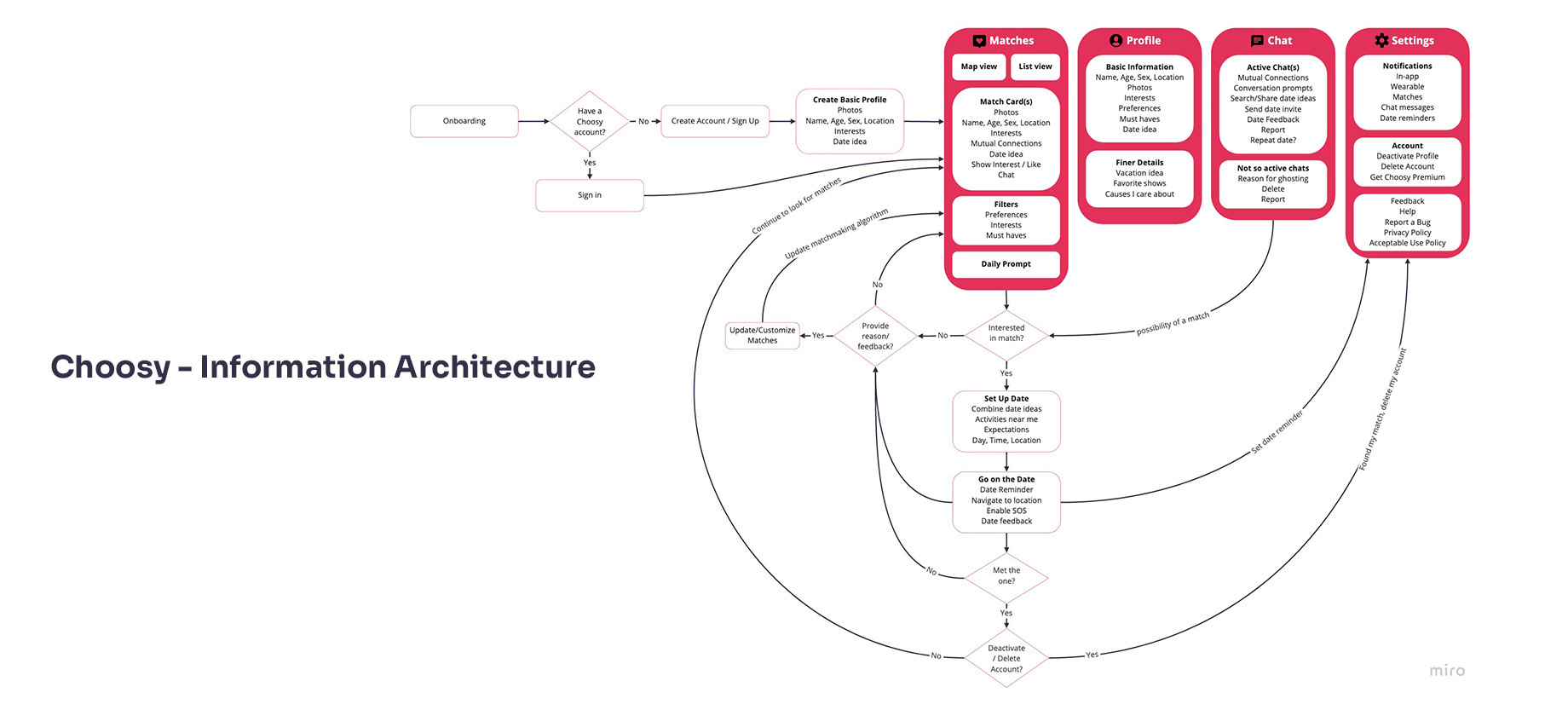
4 Deliver
We worked on the Information Architecture (IA) and flow diagram. Matches, Profile, Chat, Settings and Date Plans were added as the main features.
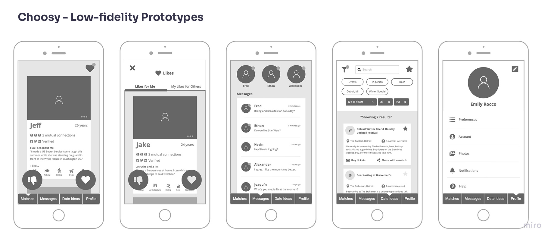
Low-fidelity prototypes were created as per the Information Architecture using grayscale screen layouts.
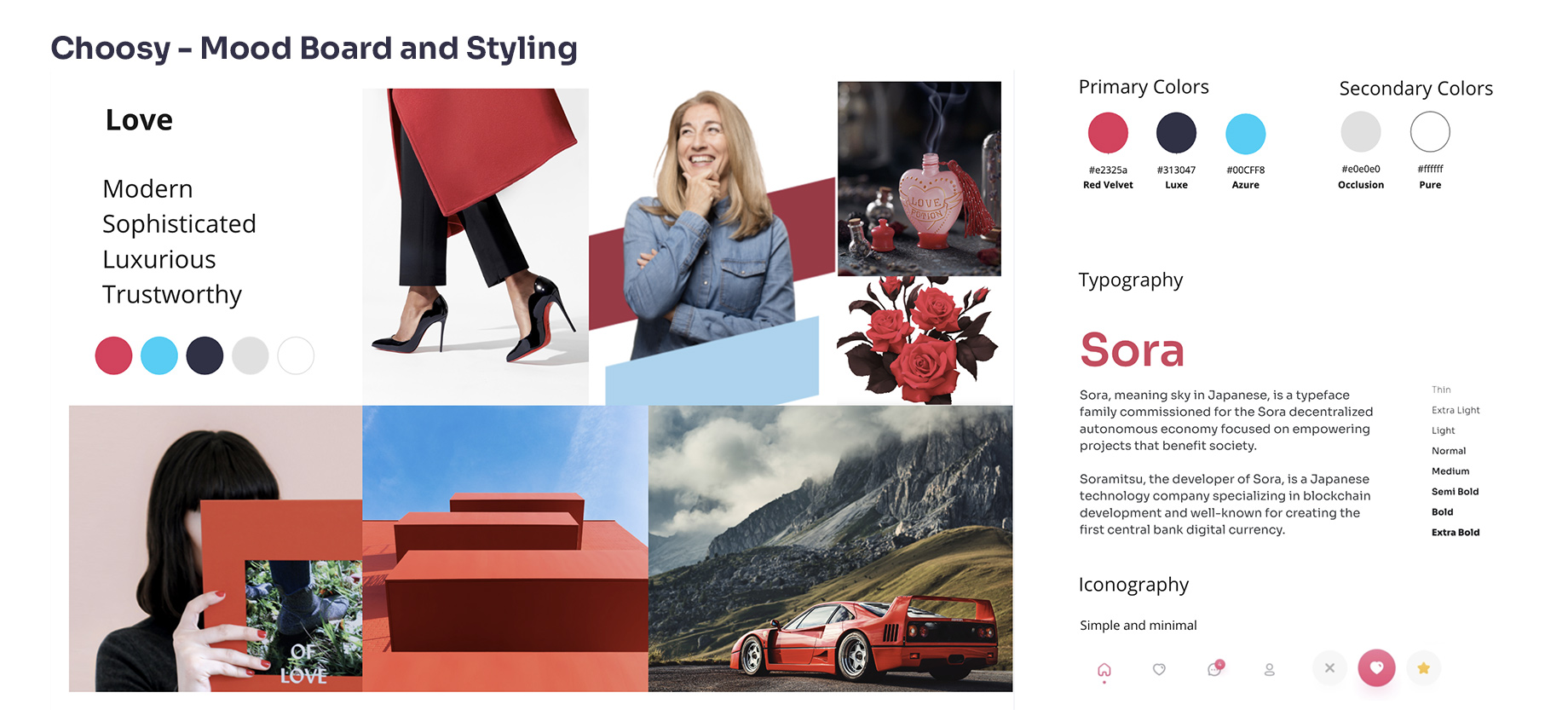
We generated mood statements using our personas and Mood Board based on the emotions they experience. We defined the GUI theme, styling, logo and branding, color palette and fonts to use in designing our app.
We tested the low-fidelity prototypes and refined them further. We made the following changes to our Visual Designs based on the feedback from usability testing:
· Changed matches list from vertical scroll to horizontal scroll view
· Added a “Maybe” decision button
· Incorporated Page headers for more clarity
· Added percentage match on profiles
· Added Location and Like status on profiles
· Removed filter parameters from the main screen view to reduce clutter
· Added interaction animations to inform users about the system’s status
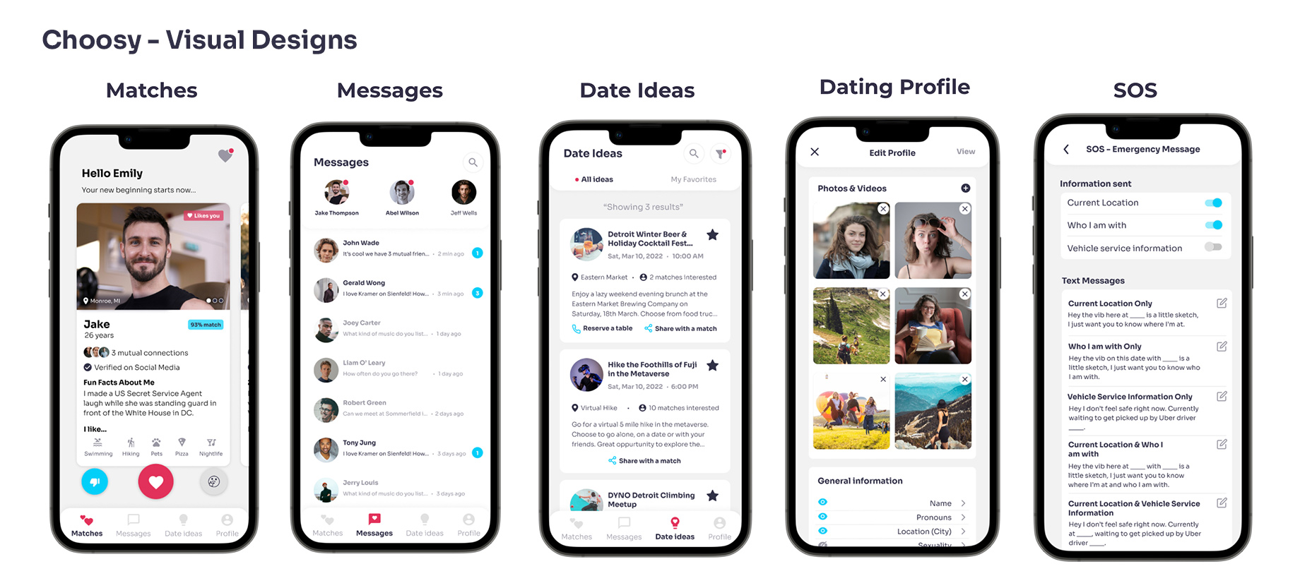
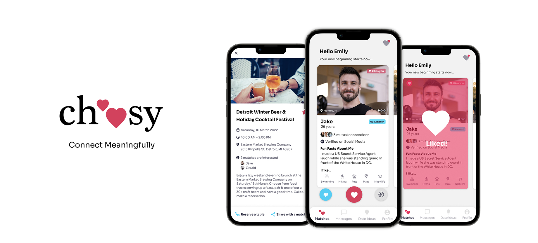
Matches
Users can choose to like, ignore or decide at a later time. The compact card view shows photos, name, pronouns, age, match percentage, location, like status, mutual connections, social media verification, prompt, and activities they enjoy doing. Users can click into the card and see more details like job, interested in looking for, description about the person, more prompts and instagram photos if linked to their account.
Liking a Match
After liking a match, users can click on the heart icon at the top right corner to check out the profiles they liked and the matches that like them. They can choose to message a two-way match if they wish to.
Date Ideas
Users can set filters like location, interest, time, etc and find ideas for activities near them. The ideas show what the event is about, date, venue, time, brief description and buttons to favorite, share with a match or sign up for it. Clicking in to see details shows mutual connections and matches that are also interested in attending.
Profile
Users can add to or edit their profile, set specific preferences such as age, religion, habits, etc to receive relevant matches. The SOS feature lets users configure a message to be sent to emergency contact while on a date. Account allows users to adjust profile visibility or delete their account. Notifications allow them to choose how and what they get notified about. Help section allows them to find more information about the Choosy app.
Next Steps
Our next steps are to plan for and conduct usability evaluations on the visual designs our target audience. Usability issues found will be fixed and the designs will be tested again.
Reflections
We had a great time collaborating on this project. Our efforts started to pay off when we got positive feedback from our target audience. We designed the interactions to feel positive and inclusive and they said they felt it while interacting with the prototype. Most people that saw our app mentioned that Date Ideas and SOS are unique features. If we had more time on the project, we would have liked to collaborate with app developers to code the Minimum Viable Product version of Choosy.
If you like what you see and want to collaborate, email me.
askamoolya@gmail.com